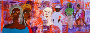
Color is a powerful tool in the world of art. It has the ability to evoke emotions, convey meaning, and create visual harmony. Understanding color theory is essential for artists, as it allows them to make informed decisions about color selection, mixing, and application.
In this comprehensive guide, we will delve into the fascinating realm of color theory in art, focusing on pigments, color properties, and the art of mixing hues to achieve desired results.
The Basics of Color
Before diving into the intricacies of color theory, let’s explore the fundamental concepts that form the basis of color understanding:
1. Primary Colors
Primary colors are the foundation of all other colors. In traditional color theory, there are three primary colors: red, blue, and yellow. These colors cannot be created by mixing other colors and can be combined in various ways to produce a vast spectrum of hues.
2. Secondary Colors
Secondary colors are created by mixing equal parts of two primary colors. The three primary-secondary color pairs are:
– Red + Blue = Purple
– Blue + Yellow = Green
– Red + Yellow = Orange
3. Tertiary Colors
Tertiary colors are the result of mixing a primary color with a neighboring secondary color. There are six tertiary colors, including red-orange, yellow-orange, yellow-green, blue-green, blue-purple, and red-purple.
4. Complementary Colors
Complementary colors are pairs of colors that are opposite each other on the color wheel. When placed next to each other, they create contrast and intensify each other. For example, red and green are complementary colors.
Understanding Pigments
In art, pigments are the substances used to create color. Pigments can be natural or synthetic, and they come in various forms, such as paints, inks, pastels, and colored pencils. Understanding the properties of pigments is essential for artists to achieve the desired colors and effects in their work:
1. Hue
Hue refers to the color itself, such as red, blue, or yellow. When discussing pigments, hue is a way to describe the specific color in question.
2. Value
Value refers to the lightness or darkness of a color. Artists often use shades (darker versions of a color) and tints (lighter versions) to create contrast and depth in their artwork.
3. Saturation
Saturation, also known as chroma or intensity, describes the purity or vividness of a color. Highly saturated colors are vibrant and intense, while desaturated colors are muted and dull.
4. Transparency
Pigments can vary in transparency, from opaque to transparent. Transparent pigments allow light to pass through and are often used for glazing techniques, while opaque pigments block light and provide solid coverage.
The Color Wheel
The color wheel is a visual representation of the relationships between colors. It helps artists understand how colors interact and can be used effectively in their work. There are two main types of color wheels:
1. Traditional Color Wheel
The traditional color wheel is based on the three primary colors (red, blue, and yellow) and their interactions. It consists of 12 colors, including primary, secondary, and tertiary colors, arranged in a circular format.
2. Modern Color Wheel
The modern color wheel is based on the principles of color psychology and the concept of warm and cool colors. It divides colors into warm (red, orange, and yellow) and cool (blue, green, and purple) categories, allowing artists to create mood and atmosphere in their artwork.
Color Properties and Their Effects
Understanding the properties of color can help artists create specific effects and convey emotions in their work:
1. Warm Colors
Warm colors, such as red, orange, and yellow, evoke feelings of warmth, energy, and passion. They can create a sense of excitement and intensity in artwork.
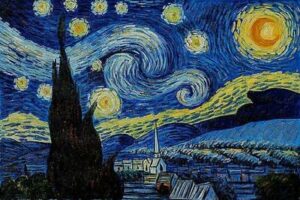
2. Cool Colors
Cool colors, including blue, green, and purple, convey a sense of calm, tranquility, and relaxation. They are often used to create a peaceful or serene atmosphere.
3. Color Harmony
Color harmony refers to the pleasing arrangement of colors in an artwork. Different color harmonies can create various effects:
- Complementary Harmony
Using complementary colors (opposite colors on the color wheel) creates contrast and vibrancy.
- Analogous Harmony
Analogous colors (colors next to each other on the color wheel) create a sense of unity and cohesion.
- Triadic Harmony
Triadic colors (three colors equidistant from each other on the color wheel) provide balance and variety.
4. Color Temperature
Color temperature refers to the perceived warmth or coolness of a color. Warm colors appear to advance in a composition, while cool colors recede. Artists use this property to create depth and perspective in their work.
Mixing Hues
The art of mixing colors is a fundamental skill for artists. Whether you’re a painter, a digital artist, or working with any other medium, knowing how to create the colors you need is essential. Here are some key points to consider when mixing hues:
1. Start with a Limited Palette
When you’re beginning, it’s often helpful to start with a limited palette of primary colors (red, blue, and yellow) and white. This allows you to learn color mixing basics without overwhelming yourself with a wide range of pigments.
2. Understanding Color Bias
Each pigment has a color bias, which means it leans slightly toward one of the primary colors. For example, a warm red may have a slight bias toward orange, while a cool red may have a bias toward purple. Understanding color bias helps you predict the results of mixing.
3. Color Mixing Techniques
- Additive Color Mixing
This method is used in digital art and involves adding colored light together. Red, green, and blue (RGB) are the primary colors used in additive color mixing.
- Subtractive Color Mixing
In traditional art, subtractive color mixing involves mixing pigments together. It’s based on the three primary colors: red, blue, and yellow. Mixing these pigments can create a wide range of colors, including secondary and tertiary hues.
4. Practice Color Gradations
To understand the subtleties of color, practice creating gradations or gradients. Start with one color and gradually mix in small amounts of another color to create a smooth transition from one hue to another.
5. Use a Color Chart
Create a color chart that showcases various color mixes using your chosen palette. This chart can serve as a valuable reference tool for future artwork.
6. Experiment with Color Temperature
Mixing warm and cool colors can produce interesting and dynamic results. For example, mixing a warm red with a cool blue can create a vibrant purple with visual depth.
7. Neutralizing Colors
To create neutral or gray tones, mix complementary colors or add their complements to a color. For example, mixing orange and blue, which are complementary colors, can create a neutral gray.
Color in Different Art Forms
Color theory is applicable to various art forms, including painting, graphic design, interior design, fashion, and more. Here’s how color theory plays a role in some of these disciplines:
1. Painting
Color theory is fundamental for painters, as it guides color choices, composition, and mood in their artwork. Artists can use color to convey emotion, create focal points, and establish visual harmony.
2. Graphic Design
Graphic designers use color theory to create visually appealing and effective designs. They consider color psychology to evoke specific emotions and achieve the desired message.
3. Interior Design
Interior designers apply color theory to create harmonious and functional spaces. They use color to influence the perception of space, mood, and atmosphere within a room.
4. Fashion Design
Fashion designers use color theory to create clothing and accessories that appeal to different tastes and personalities. They consider color trends, cultural influences, and color symbolism.
Conclusion
Color theory is a rich and multifaceted discipline that plays a pivotal role in the world of art and design. Whether you’re a seasoned artist or a beginner, understanding pigments, color properties, and the art of mixing hues is essential for unleashing your creative potential. By mastering color theory, you gain the ability to create powerful visual statements, evoke emotions, and communicate complex ideas through the language of color. It’s a skill that empowers artists to bring their visions to life and captivate audiences with the mesmerizing world of color.